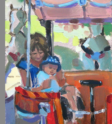
Last week end, I wanted to paint but didn't fancy braving the cold outside so I was looking for inspiration for a studio piece. I suddenly remembered a lovely carousel picture a friend of mine posted on Facebook (with her mother and child having a ride). I decided to have a go at it and obviously asked for her permission. I decided to have fun with the colours and keep it loose. Here is the result:
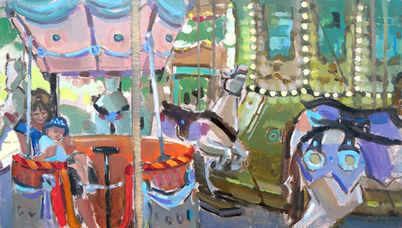 |
| Ride on the carousel 9"x16" oil on board |
Here is below the original photograph. What caught me eye was the combination of colours, the lovely lights of the carousel, the movement of the scene, the interesting composition, the presence of the people, and the light of the trees and sky shining through in the background. Quite unusually, I decided to keep the format as it is and didn't apply any cropping:
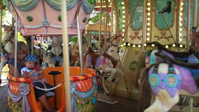 |
| Original photograph |
Before starting the painting, I decided to apply some photoshop filters to the photograph to try to simplify the colours, drawing and values. When working outside you are forced to make quick decisions, but when working in the studio it is easy to end up putting too many details so that's why those filters can help:
 |
| filter 1 |
 |
| filter 2 |
Afterwards I applied a grid to the photograph and reproduced the same grid on my canvas in order to transfer the drawing easily.
I then started blocking in the canvas with colours to quickly cover the whole canvas and define the values and relation between colours:
And here is the final result:
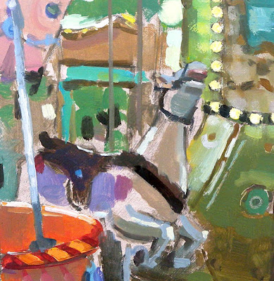 |
| Detail |
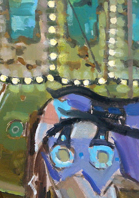 |
| Detail |
 |
| Detail |


That is SO COOL, I guess it would be a little tough painting as the carousel went around and around. Great job. I love how your studio work looks like your plein air work.
ReplyDeleteThanks Douglas! I don't think my paintings ever got described as "cool" so I'm making the most of this compliment! I agree painting a moving carousel is probably pushing the limit of plein air to the max so I'm glad you don't blame me for working with photographs :-)
DeleteVery nice Valerie. You've kept the colours very clean and fresh and the brushwork energetic. It's an uplifting piece to look and the human element adds another dimension. That detail shots could make a nice paintings themselves too!
ReplyDeleteThanks David! Glad you like it! I admit it is a bit different from my usual style but I think the subject was the perfect opportunity to use more vibrant colours a bold brushstrokes. Probably the opposite of the subtle colours of Venice in the fog! I've decided that 2013 will be more colourful and more abstract!
Deletehttp://scenariovisivo.blogspot.it/2013/02/semplicemente-dipingere.html
ReplyDeleteThis comment has been removed by the author.
ReplyDelete